Brand Identity
Cemex
Urbanization Solutions
Cemex is a global building materials company and has a brand architecture with several sub-brands. We as an agency were tasked with creating a visual identity for their sub-brand Urbanization Solutions located primarily in Mexico.
Urbanization Solutions aims to preserve existing structures instead of tearing them down to build new ones; saving not only materials and costs but also having a less negative impact on the planet.

Development Logo
Because of Urbanization Solutions being endorsed by Cemex and part of their portfolio, there was no ambition from the client to create a full new identity for the company. The task was to design a new logo and colors inspired by the Cemex identity but still with its own unique style.
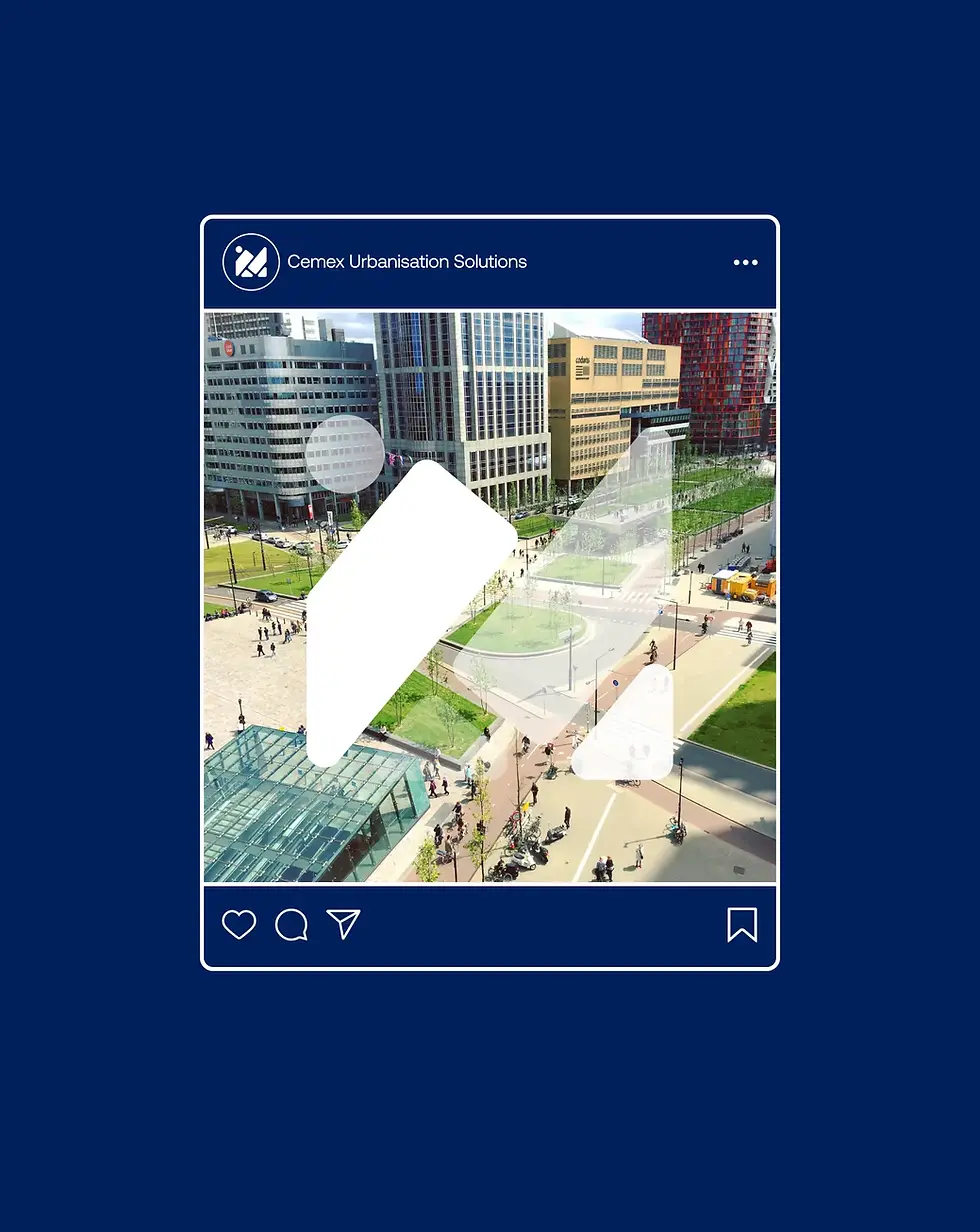
The result became a logo inspired by a top-down view of different city landscapes with buildings and roads that together create interesting patterns.The core of the idea behind it was to visualize the environmental, smart and flexible solutions of the future infrastructures.
Typography & Colours
The result became a logo inspired by a top-down view of different city landscapes with buildings and roads that together create interesting patterns.The core of the idea behind it was to visualize the environmental, smart and flexible solutions of the future infrastructures.
Urbanisation Solution by Cemex saw the cities of tomorrow as something traditionally built but with smarter, more versatile designs integrated in nature. We, therefore, choose to stick with a traditional blue together with vibrant greens and light colors.
This project was made at .Monks
Role:Brand Designer